

Illustrating my first book: what I learned
A behind the scenes review of everything I learned while illustrating my first children's book.

July has been very quiet here on my Substack, as there’s been lots happening in real life. I’ve been squirrelling away on a new book idea, my non-illustrating job has been very hectic and my toddler is teething (again). Suffice to say, I haven’t had time in the corners of life, to write my regular posts this month - and I’ve missed it. Where most have my posts so far have been about obersvaetional sketchbooks, I thought it might be interesting this month to share a bit about my first illustrated book. The two are, for me, very much connected.
I’ve also been finding it hard to find meaning in anything while we witness the intentional mass starvation of people in Gaza. But I hope this post, which looks at my first picture book process, might provide a moment of calm amongst everything that’s going on both at home and in the world.
My first full picture book project
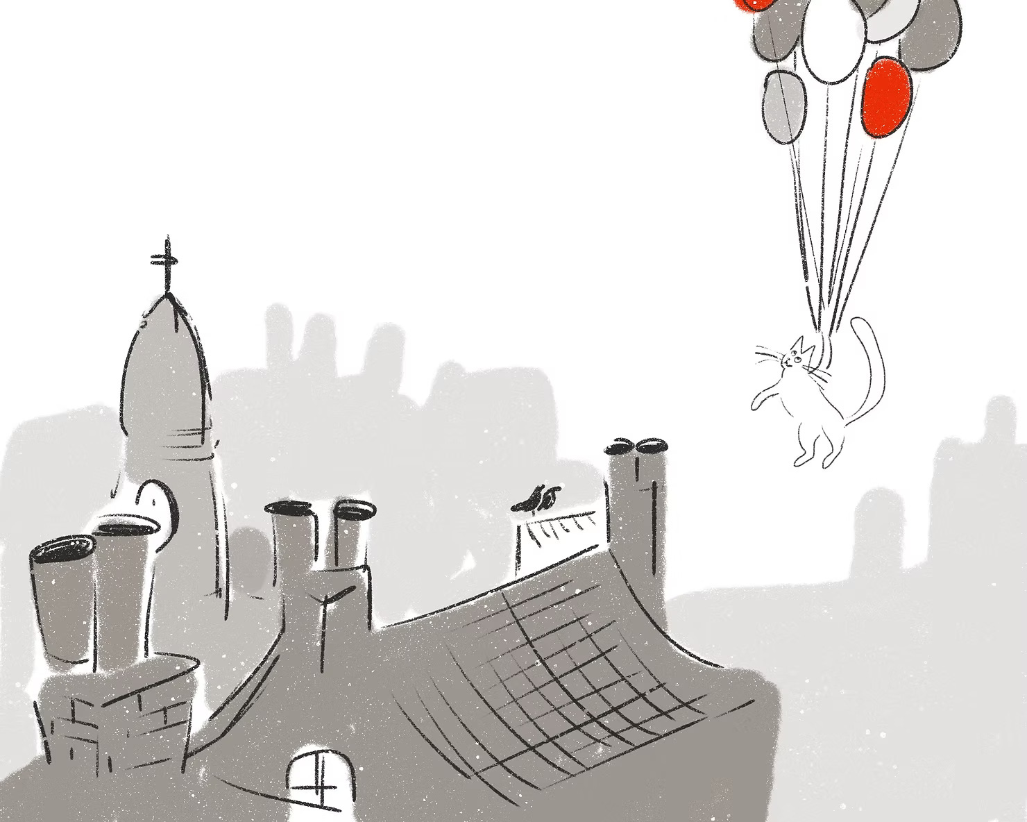
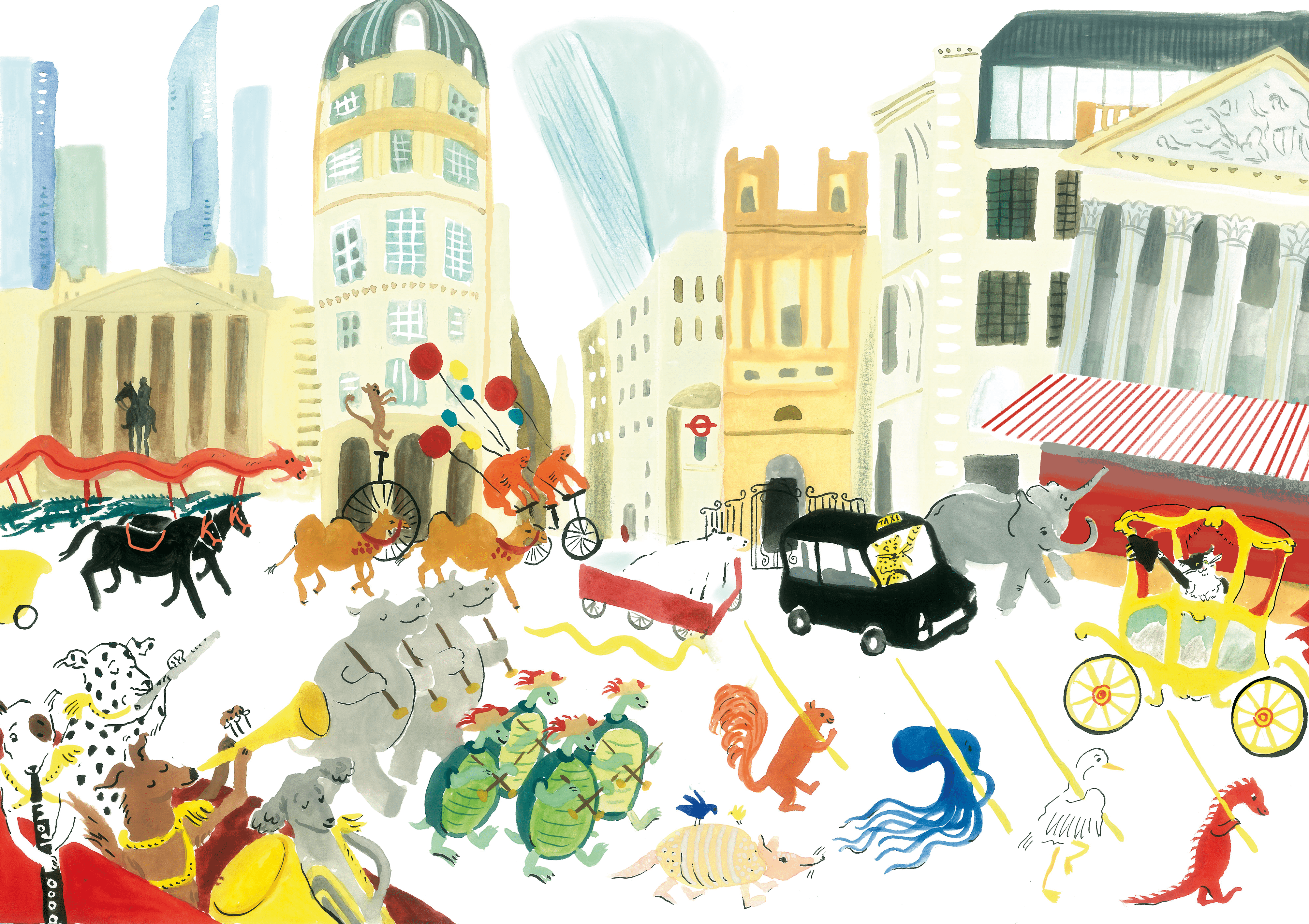
In 2023, I illustrated my first full picture book,' The Curious Cat and the Lord Mayor's Show' by Christy White-Spunner. It was unique in that it was actually commissioned not by a traditional publisher, but by The Lord Mayor’s Office itself. It’s a story about a cat who attends the Lord Mayor’s Show and eventually becomes, you guessed it, the Lord Mayor.
It’s important to mention that I had an assistant for this book, who was the expert in all things cat. Maybe this was cheating, but I like to think of it as research.
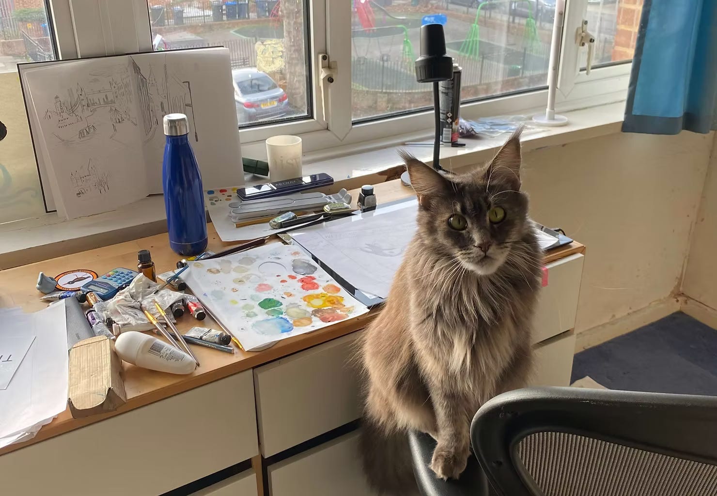
Drawing from life is always relevant
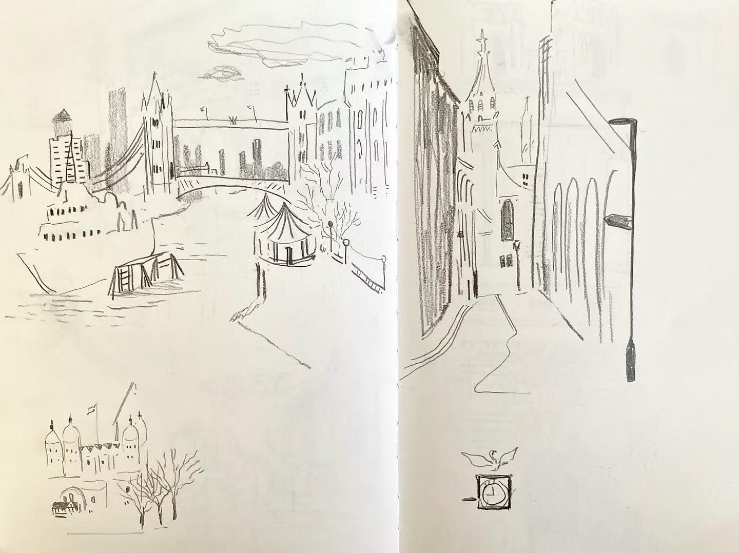
The book takes place in a version of London that's inhabited totally by talking animals, so I'd thought at first that I wouldn't need to use my observational drawing practice. I should have known better! When I came to rough out compositions, I really struggled with buildings and scale - particularly when I wanted to include some real landmarks that feature in the story.
So I set off with my sketchbook on a very windy day to draw on London Bridge and around Mansion House and Fleet Street, where the book is set. My drawings were basic, but nonetheless they did that magic thing of making me really look at what was in front of me, and remember the location in more detail because I’d gone to draw it in real life. From looking and drawing on location, I got back to my desk able to look at my sketch and re-experience looking at those buildings I hadn't been able to conjure up in my imagination. So I realised that even in non-naturalistic projects, my sketchbook will always be there to use as reference and a guide. I talk more about the benefits of observational drawing in another post if you’re interested.
Words and pictures must work together
Now this one sounds very obvious, but it wasn't until I came to do the design myself as part of this brief that I came to fully appreciate what I'd been told about the interplay between text and image. I'm not saying I got it right 100% of the time in this book - in fact I definitely didn’t - but it certainly taught me a lot.
I experienced a lot of frustration when I had painted an image only to find that the text didn't have enough space, wasn't visible enough or looked drowned by white. It was satisfying to try and solve these issues but gosh did I want to throw my computer out of the window at one point! I had used InDesign before but this really put my knowledge to the test. It's a skillset I've come to really appreciate in the months since finishing the project.
A limited palette saves you time and heartache
I love colour. But sometimes I love it so much I want to put every single colour into an artwork. And sometimes less really is more. I learnt about colour theory from The Goodship Illustration and Tania Willis' wonderful workshop (which you can do yourself here) and this has helped my work a lot. I try and set parameters for colour - for example choosing 3-7 colours for a piece of work rather than 37.
In this book, I chose a limited colour palette that I felt reflected the spirit of London - I needed a bright red in there for the buses, post boxes and ceremonial outfits. I had a yellow for the gold around the City of London, and I combined these with some blues and greys that felt right for the sky and landscape.
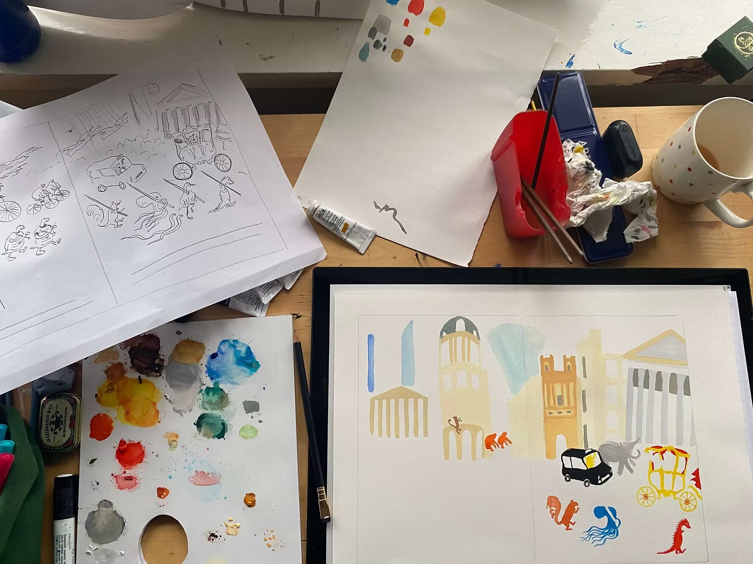
Having set parameters took away some decision anxiety, and also meant that all of the pages worked together as a whole - which is very important in a picture book. There is also a lot of white space in the book, which again I felt worked best with a limited palette. In the picture above you can see I painted with my colour reference swatches always in sight.
Use materials that you're comfortable with
I toyed with the idea of doing the picture book artwork for 'The Curious Cat and the Lord Mayor's Show' digitally in Procreate on my iPad. I thought perhaps this would be easier and quicker. But then I realised that I was overcomplicating things - I know painting best so I chose to paint the book.
I also find it challenging to maintain my visual style digitally. While I’ve since learned more about using Photoshop to bring handmade elements together digitally, I hadn’t used it at the time. So I decided not to risk not knowing what the final art would look like and stick to painting, that I knew best. In the end I’m very glad I did because actually this gave me a lot more confidence in paint.
Working with a familiar material was great. Of course, painting the artwork can make the process longer - especially if there are big changes. I made sure to send quite detailed roughs in 2 rounds so that the rest of the team could see what I was planning. I made the first set digitally for ease, and the second I made by hand at true scale to help me understand the level of detail I could use. I made the second rough on layout paper with black ink and scanned them.
I was lucky and had no major changes to make once the commissioning team had seen my work, so I could move straight on to finals. Once I painted everything on paper, I scanned the pages and tweaked them a little in photoshop and procreate to adjust colour balance and clean up the whites.
Make timelines work for you
A question I often hear asked at illustration talks is 'how long does it take to illustrate a book?'. I've also wondered this, and have scribbled various answers in my notebooks hoping to hear the perfect formula. But it seems like a real-life version of the cliche how long is a piece of string. What I discovered from working on this book is that how long you spend on a book isn't always up to you, so you need to be adaptable.
I was invited onto the project about 4 months before the artwork was due, and I ended up having about 6 weeks to create the finals once the story was complete. We had also recently moved house and everything was a bit topsy turvy to say the least. It was a tight timeline - I won't say it wasn't. But it worked out! So my takeaway here is no matter what time frame you're given you've got, there will be a way to work it out - whether that be changing materials, or perhaps just being clear with the publisher about the number of rounds of changes you will be able to do. The benefit of working fast was I had no time to overthink my decisions - and this was very useful as I think had I had lots of time I'd have doubted myself and perhaps overworked the art.
Enjoy it!
Having wanted to illustrate a book for many years, I reminded myself throughout the process how exciting it was to be enacting that desire. This helped me in moments where I wasn't sure if I'd meet my deadlines.
Every book I illustrate will be a bit different, and have its own flow, and this one was a great start in showing me how to stick to what I know and trust myself to be able to deliver a project on time. I'm intrigued to see how my approach might change over the years.
This process has really helped me developing my own writer-illustrator books. None have yet to hit the shelves, but they are slowly emerging into the world I hope.
Things I’m enjoying:
Supporting fundraisers for Gaza where I can. Check out the events and fundraisers run by Sarah Dyer, Rise Raise Riso and Tania Willis to name a few.
The Mare of EastTown on Now TV - Kate Winslet plays a complex cop in a twisty case.
Other places you can find my work:
My portfolio and past work is on my website
As always you can also support my work through my online shop
Ahh that’s so interesting Carys! Lots of good advice - and wow that was a tight deadline- bravo!!
When you write and illustrate and self publish your own book, there should be no one asking for alterations to your work to suit them and giving you their deadlines. 😁